It just takes experience, an eye for form and a command of lighting. rules. and no rules. and you gotta bend and break them rules if you want something better than just fine. "That's fine, Mr. Beavers, how much are you nailing us for this dull looking portrait of my boss?" Or would you rather be hearing, "Man, that is, oh wow, kick ass, Wick, rocking dude, fantastic, I never knew I looked that cool! How much can I pay you?? How soon??? It ain't about the money because we might have poked into Yale Law rather than hanging around park benches, bar rooms or railroad freight yards as young snappers...
Getting it just right takes judiciously making choices as to all the contributive aspects you bring to- and come along with- the creative portrait process --- and here are a few:
1) Location- where do you shoot your subject? What do they do? Where do they hang? What are they known for? What do they love to do? Editorial stuff usually gets handed down -a person with a location- "go shoot Lenny Kravitz in his recording studio next Tuesday at 3". Who what where when - all they leave you is how! So suck it up and take the money.
If it's left to you, remember- more and more these days, portraiture shot in the studio is basically left to the state photographers- working at the DMV and the criminal justice systems. Avoid that look unless you rebut it for a fair reason and it works. Maybe your father-in-law ought to be in prison?
2) Background- Once the location is chosen, get specific and dig for the background- look for contrasts and lines, shapes and light that you can build into a background that complements the subject. Remember your portrait's constraining dynamic range- if you have too much range, you're gonna start losing highs or lows. If your subject is light-haired and skinned, try looking at putting them in front of a dark background. Opposite for dark-haired and skinned. This will help make them pop off the background and be better seen in the portrait. If you break forms or lines with a head or body, if you light one side of the face and put it in front of the darker part of the background, if you put the dark part of their face in front of a brighter part of the background, if you break/segregate different light temperatures, and many more ideas that stop the viewer from being swirled around in the photograph, you will begin the creation process of 'making a great editorial portrait'. You want to stop eyes from moving at your subject, get them to draw to the subject, maybe even the eyes of the subject. Stop, meet, see, look, learn, know. Next!
3) Clothing color and selection is also something to consider, as are any extraneous accessories your subject may wish to accompany him/her/themselves with in the portrait. I am not for the khaki and oxford look alike outfits in any way- when does anybody really dress that way? When I was a kid, my mother got me and my brother both blue blazers. I never wore mine on days when my bro wore his. Imagine wearing khakis and a blue brooks brothers shirt - just the same as everybody else? Sick. And THEN go stand in the sand dunes at dusk? SICKER. And pay some wack job for that so-called creativity in making my "family portrait"????
I wanna gag, hold on, right back. Hey, get out of those dunes- you're stepping all over the grass, and that grass holds the beach in place, you idiots!
OK, alrighty, that's better now.
Here we fade out of the numbered points and just go native:
Anyways, any portrait can follow rules or break them. There really are no rules- you think da Vinci or Michelangelo followed rules? let me see, eye before e except after si- but let's start with what we see: I wanted to show you something about what looks cool and interesting and what doesn't. And let's see- one breaks rules and the other follows them. Which one would you rather see? Which one do you prefer to look at? Which one holds more interesting information about the subject?
Like a boat builder once told me: 'if it looks good it is good', when speaking about yacht design. Of course, this intuits somebody must have thought a double ender looked good or they never would have built them... There's enough different folk in the world and we are never gonna please everybody. But let's try to please ourselves and get on with this ok?
Check these out and let me know which picture you like better.
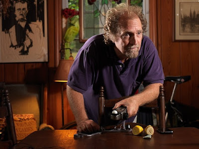
Actually, also look at the well-lit side and the less well lit side of the second photograph and ask yourself, which side of this guy's face is more interesting to look at? The fully lit, standard, well covered, well exposed side OR the jagged, hollow'ed out, sculpted, shadowy, flaring, light/dark contrasty side? We ought to know that in order to get texture, we like hard light at rakish angles... I really try to avoid big soft boxes in portraiture, but you have to be polite to especially women of age (who after all are paying you) when you start looking at showing off your abilities as a strobe meister to show skin textures and little wiry unplucked whiskers hanging off wrinkled plump double chins, right?

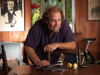
The portrait above- as well as the one below- is shot at 5.6 at around 1/8 second (camera was tripoded, two flash heads/lights, key was off to right side of photo and was set at 1 exact stop above ambient/natural light, iso 50). So let me pause and remind and re-ask: is this a two light portrait? I used two flash heads. Or is it a three light portrait? It's actually a 4 light portrait, as the tungsten kicks in its own bright little way... All lights are metered and placed in intelligent pre-visualized spaces in the photograph's exposure zone (system).
Remember- meter the ambient by finding a place that you and Ansel want in Zone 5 (18% grey). Use that meter reading to add 1 stop for your key light flashing from the other side of the face. Set your light to that reading. Now you have a 2:1 ratio of key to fill lighting. You are using ambient as fill in this case. Obviously, you can use the ambient as key by simply dialing in your flash 1 stop BELOW ambient. Hey what if there's no ambient? Use a reflector, a white card or use another light, duh. I set up the rim/backlight at a stop above key to make it kick. Sometimes, for a halo look, kick up two or even three stops. Be careful though, if you go more than two and a half, you're gonna start frying (not literally, but you'll be overexposing) hair on your subject...
Obviously the short duration flash holds the image sharp if there is not excessive movement. One little gear freak pointer for location portraiture: go to your hardware store and get yourself a few of those rheostats on extension cords so you can unplug the lights that will effect the portrait and replug them into your rheostated extension cords. You then have full finger tip control of the tungsten lamps involved in the portrait as well as all your other lights based off ambient.
Looking again at the first portrait: fact is, we have a pretty (dull, if you ask me) basic ratio of 2:1 when you compare ambient to flash. Check it out. It is better than an on camera flash any day, but to my eye it totally lacks zing, song or clout. Might be the model (ahem) but we were shooting this for demo'ing the lighting weirdness I bring to portraiture that breaks rules and make portraits look real"er", better and cooler.
Next one below is totally different and breaks the old PPA and classic photography portraiture rules! To good effect. Yeah! But this doesn't mean we give up control in any way- we still strive to use the light as a tool to get us more information about the subject. How sharp is the line between the eye socket and the forehead? How about the jaw bone line? How about the shape of the head and the wrinkled brow? Or the break between the arm and shoulder and the background? You wouldn't have any of this information about your subject if you didn't have that raking overextended rim light busting over onto the guy's side view, would you?
Does it really look fake or placed? Or do the lights you see in classic portraiture begin to look more fake and set up? How about the nice little round highlight on the background behind the classic studio or office portrait? Dead and Gone- Good riddance! I am fed up of seeing the same old portrait style again and again.
Let those photographers who follow the rules deliver the typical classic portraits.
We'll bring in the cool, hip, fun and happening ones.

The lighting ratio on the second portrait between the key light/flash camera right (same as above) and ambient is still 2:1, but I have now simply spun the backlight from the photograph above around to fire at the guy's rear/ right side. This gives the portrait more edgy form as well as a hair/rim light effect and breaks the guy away from the busy tungsten/ambient lit background- this is that aspect of using a break in light temperatures I mentioned above- you have the tungsten and the daylight in the background. The flash light helps separate the subject away from his background with just a little selective and judicious use of unique light color/temp. It also blasts into the darker side of the otherwise short lit and dull 2:1 ratio short lit portrait. To my eye, this is a much more interesting and exciting portrait than the classic borderline khaki and brooks brothers shot above it- the one you might have learned in photo school from some old geezer that smelled like fixer -what the f*(*&k is that?? a new ABC weekday series, the FIXAH. Nope. You youngsters may have heard of film?
One other point of interest is the tungsten light, the natural daylight and the flash are all nicely balanced spatially and doing their thing to help create and make the subject's surround/environment a lot more fun and interesting. I thought for a moment about gelling the rim/hair flash with some very warm gel but thought- again, straining myself- for a couple of seconds about how the light temp/color contrast was gonna make its own little mark, thereby anchoring the subject in the photograph even more. Also contributing- the repeating rectangular forms of the window and paintings on the wall help frame the subject, too.
Finally, even the seat post of the mountain bike contributes to anchoring the subject into the frame of the portrait. Simpler is better usually, but sometimes you can use mayhem to find attractive angles that help define your subject and give your portrait a look even a great stylist could not have effected better.
Summary
You do have to retain a little jusiciousness as to when you are asked to photograph the women's sewing association and church group. They are not gonna be so happy with broken rules portraiture. But a rockstar? A cool dude? A beautiful dame? A powerful exec? You bet!
Break them RULES! Put down that racing form and pay attention. BREAK THEM RULES.
Wick


No comments:
Post a Comment