Just sit right there and READ my BLOG!

Just sit right there and READ my BLOG!
Check this out...

MoTion

Showing posts with label Lab Color Mode Curves adjustment. Show all posts

Monday, August 23, 2010

A lot of talk about White Balance. Why? It's the most IMPORTANT ADJUSTMENT you can make.


WHITE BALANCE
and why it is the MOST important color adjustment you can make

Sensors to date shoot everything in color. For black and white images, there are innumerable ways to "lose" your color. If you simply use a format to black and white command, you generally throw out about 75% of the digital information of your original capture. If you ponder that most great
black and white photographers shooting digital today maintain their black and white images in RGB color space and while you've got that in your craw, go look at the old masters and you will note there is almost always some degree of tonality in the image. For sure they were shooting black and white film, so the tonality came in at the printing stage. Or it was hand toned after the print was made.
For us, the tonality is implemented at the post production/image processing stage. And I recommend you NEVER produce any of your images in grayscale and never throw away any information that came with the original image. But I already digress.
I wanted to speak quickly about WHITE BALANCE and why I believe it is the most important color adjustment you can make. Period.
Picking the color of your whites results in setting the tone, the mood of the entire photograph. No really! And the best way to pick your whites, working on a calibrated monitor, is to use LAB color Mode Curves and a color picker dropper tool to read your numbers.
And killer thing is, you can do this non destructively on any image- from a fresh new TIF to an old and tired jpg. It can result in an entirely new way of seeing your image!
Here's how:
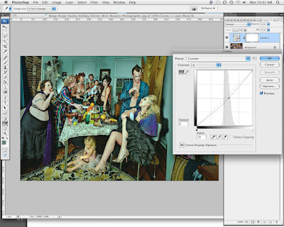
1) Open any image file and put it into LAB color mode (Mac: IMAGE>MODE>LAB).
2) On your layers palette, open up a curves adjustment layer. You will notice there are only 3 channels, Lightness, A and B. Your lightness channel adjusts luminosity, the A channel curve will adjust the Red and Green channels and their respective relationship, the B channel curve will adjust your Blue and Yellow channels respectively. For our purposes, it might suffice to consider only the color channels for this MAJOR move in White Balance as Luminosity is a contrast/brightness issue, not a white balance one.
3) Open A Channel curve and place a point on 0,0, right smack in the middle of the chart and the curve. This IS your present Red/Green White Balance Point. If your midpoint is BLACK, that means it is active and can be moved with your keyboard arrows. Move it right to make your White Point more GREEN, move it left to make your white point more RED. Set it to your new choice. For a warmer final image, you might bump it slightly into the RED. For a greener final image, move it right into GREEN. Click OK.
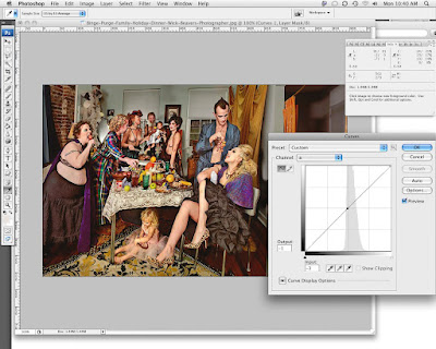
4) Open another LAB curve and this time open the B channel to adjust the Blue and Yellow channels selectively. Same thing, put a point in dead center of the chart in the midpoint of the
curve, Right, that's the present Blue Yellow balance of your image's present White Balance. For warmer tones, bump the point left into Yellow, or for cooler tones, bump the midpoint of your curve right into Blue. (I prefer to use separate LAB curves even though one can get the same end result to this point, but I like to go back to my adjustment palette and reduce opacity moving the opacity percentage sliders to fine tune the end result of my adjusted tones.
5) To alter nothing but the colors in this procedure, make sure your adjustment curves are in COLOR blending mode as opposed to Normal blending mode. You can experiment with blending modes,one of the more interesting, and as expected, would be to change the blending mode to Luminosity when you are adjusting the A or B channels (color channels, NOT a luminosity channel) and you will see you have NOT affected the colors in the Luminosity Channel whatsoever. As opposed to RGB color spaces where a color adjustment WILL affect the Brightness of the image and a brightness adjustment will affect the colors, in LAB mode these
adjustments are perfectly independent. NICE and non destructive. And MORE control.
So, once you've made some adjustments in both A and B channels and your blending mode is set to COLOR to make sure we are not changing anything BUT colors, play with the Opacity of each curve to make your image's tone/White Balance sing!
6) There are times when you need a pure neutral white balan
ce. Like when you're shooting a product like paint or fabric for absolutely correct color rendering. In this case, when each curve is open and you are looking for perfectly neutral white. remember there has to be something in your image you declare is white or neutral- without color or tone. Hopefully you shot a greytag macbeth color card, but if you didn't, you have to choose something in your image that is neutral. Once you find something, open your LAB curve adjustment layer and put your highlighted point
in your curve midpoint, open your INFO palette and NOTE the Lab readout in your info palette when you place your color picker on a chosen neutral point in your image. I chose the white glove as being "neutral white" in this image. You will see how my B channel reading is -9 from neutral (which is of course, 0). I need to move my white point to the Yellow side to bring the glove, which is reading blue in my image to neutral "0" white balance point. I leave the highlight picker on Info on the Glove and using my keyboard arrows to move the B curve midpont left until the B channel INFO reading is 0 or neutral.
Next I do the same thing for the A channel noting the original image's neutral white balance is actually too GREEN or set at -3. I need to bump the curves midpoint to the right to make it neutral/ equally red and green. At this point, you might notice a small change in the other channel, due mainly to your choosing another point on the glove for being your neutral white point. You can go in close and make sure you pick the same pixels if you want to get exact but remember!! You are just choosing your own NEUTRAL, not what is actually. So this method is always going to be subjective. To get it dead right, you need to shoot a color card.
Okay, I claim with a little or a lot of tweaking of the tone of your image, you will affect the way it is perceived a whole lot more than changing anything else in your image.
Any argument will NOT be accepted..
Ha!
Have a great photographic week!
Please visit my website www.wickbeavers.com for a look at some cool (or warm) images.
Wick


Wednesday, March 18, 2009

Squeezing Every Last Drop of Color Out of my Pictures with Photomatix and LAB mode color curves, a practical look with pictures

Ascension of Christ Ft Lauderdale Series

Hi there! Hope you're cooking in these slow times. Good time to learn and rework and rethink and retarget. I plan on coming outta this thing a whole lot better so I don't have time to feel glum. Hope you are doing well and being constructive.

I was thinking I ought to try out Photomatix. I shot recently a personal project I called "Little Pink Houses", documenting the always and ever expanding growth outwards from any city center. Miami, I have noted, due to its being contained on 3 sides (Everglades to the West, Ocean to the East and South), is in a bigger pickle than most.
And so I shot many photographs of the dull repetitious suburban architecture growing up around the edges. And I shot many in the middle of the day- my preferred time!- I just shoot several bracketed images of the same scene and expect to comp them in photoshop in post. I like harshness and reckon we'll all be seeing soft box light for eternity soon enough.

Well Photoshop's HDR automated task is "you might as well do t yourself" bad for compositing under and over exposed images- it's actually worse than that!- and I have been seeing and hearing gathering and LOUD compliments about Photomatix so decided to scope it out and use it on some of the Little Pink Houses Series. And man and WO man, I swear, Photomatix totally and completely ROCKS!
Here's the good stuff and don't look elsewhere or under the table or behind you cuz you're not gonna find the bad...
1) You download it quickly in both ready to roll and demo versions. When you
buy it, you get a key and can instantly unlock it. Or just play with it and deal with that ugly triple watermark later. Problem is you're gonna love it and you're gonna be irked you went through the process and wound up with a watermark so just BUY IT straight off. TRUST UNCLE WICKY!!! BUY IT! I make nothing...
2) There is a plug in you can buy for an extra $20 which I am not sure I'd buy. I haven't. It simply goes into Photoshop and I guess looks more streamlined but since you really need to use it FIRST in the workflow, you might as well leave it stand alone. I might change my POV when I know more...
3) Simple to use, fire it up and open the first dialogue box, IMPORT the images. Locate them, then let it rip!
You can load up the short sweet tutorial and set the settings the way they recommend- very intuitive.
I have run up to 5 -127 mb files in one batch process and the thing processes pretty quickly.
4) Mid processing, you will be delivered a wild looking image that I suppose is the composited image, seemingly half of which falls outside the monitor's gamut (and probably OUTSIDE every extant device's gamut!) with the highs flying off to way past monitor white and the blacks heading so far north they look like deep pools of carbon. So what next?
5) Tone mapping dialogue box pops up and the image is now ready to be pulled together within gamut. Detail is more painterly, the other is more photographic. I prefer to use the tone detail so far but I have only processed a pretty limited number of images thus far...

This above is the tone mapped image, 16 bit full size 127 mb ready to customize for output to Photoshop.
I save the final Photomatix HDR comp'ed image to desktop and then open it in Photoshop.
I have recently adopted Dan Margulis's Picture Postcard Workflow which is based on LAB color mode CURVE adjustments and then using apply image in (mainly) blue channels back in rgb mode to get every drop of color out of your image.

Here above is the Photomatixed image heading into Photoshop>IMAGE>MODE>LAB color mode. Wow! Remember, we are NOW gonna squeeze colors out of an image that already is marvelously WAY beyond anything we have seen or worked with color-wise since we have composited lows and highs that were beyond the gamut/luminance range of anything ever used before to capture photographic-based images. Getting closer and closer to being able to SHOW/represent all the colors in the gamut of the human eye! Remember though, we have not increased the gamut of our device, we have simply found ways to represent and bring into gamut colors and light that have never been able to be represented before. A little confusing, but LOOK!
So, in LAB mode, we open Curves in the layers palette and adjust the Luminance fir
st (in Luminance mode for no image destruction), then A and B channel colors (in color mode for no image destruction).

Above is the worked image. Every last drop of color -some I've never even SEEN- are in here now and the image has been touched up -first globally, second, locally to look its best. I have a live books site which requires images to be no more than 100kb and no longer than 920 pixels. After a very slight over sharpening (the upload and web presentation takes a piece of the unsharp masking), I save my files after making sure the metadata (FILE>INFO) is complete and has my copyright info embedded, then upload them to my site through live book's editsuite.
I know I am in a processing space right now where I am gonna overdo things- that's the way it goes- if you got it, USE it!
Hope this makes some sense and happy shooting!

Things you will need to remember shooting for HDR:
a tripod, camera set on manual with focus set. Do not change the focus or the aperture, changing the aperture will obviously affect the focal plane/depth of field. To change exposure values, just adjust the shutter speed!
It's recommended to process RAW DNG files but I have been experimenting with Photomatix'ing TIF files processed in different color temps, so a dark file would be processed from RAW to TIF Cooler, then composited with the lighter warmer image... I think that will make the 32 bit high dynamic range image even cooler!
Oh and if you are shooting for HDR on a windy day, shoot the images fast or you're gonna get some serious ghosting in the (overlain) blowing clouds.

LIGHTSTALKERS where in the world are you and what the hell are you doing there??